Faircent.com (P2P Lending)

A Complete UX/UI Redesign. Revamped the entire Faircent.com website, enhancing the user experience for India's
leading P2P lending platform.

project

Project Overview

Faircent is India's first RBI-registered P2P lending platform, operating as a digital marketplace. It connects individuals and institutions seeking credit with those offering funds, using technology to simplify and expedite the lending process. This allows for more accessible and affordable financial solutions

Timeframe

6 Weeks

My Role

UX + UI Design, Visual design, Branding, User flow, Research, Protopying + Testing

Tools

Figma, Fig jam, Photoshop, Google sheet, Google Forms Notion

The Challenge

To address increasing competition and improve user retention, Faircent required a website redesign focused on clarity and modern design standards. Users struggled to understand the platform's purpose and complete their objectives, leading to a concerning drop-off rate.

Objective/Goal

The UX/UI solution for Faircent focused on clear design and intuitive processes to enhance user retention, enabling seamless investment and borrowing experiences for all users.

My Design Process

wireframe

Empathize Research

Competitive Market Analysis

To effectively address user needs within the competitive P2P lending space, a thorough market analysis was essential. I conducted a detailed review of leading platforms, including IndiaP2P, Lendbox, LiquiLoans, and LendinClub. This analysis revealed a consistent trend: all competitors offered robust online investment and borrowing functionalities. By understanding these user-facing market standards, I aimed to inform a design strategy that would directly cater to user expectations and improve Faircent's competitive positioning.

img

Key Takeaway

Competitive UI Advantage:
  • Competitors have strong user interfaces.

Faircent's UI must be clean and simple to remain competitive.

Feature Enhancement:
  • Competitors either offer limited features or fail to effectively showcase existing ones.

Faircent will prioritize clear feature presentation and a comprehensive user experience.

User Onboarding Journey:
  • Competitors offered a smooth user experience, they lacked perceived authenticity in platform.

Simplified the User Onboarding Journey for Faircent, focusing on clear steps and minimal friction to improve user retention.

User Interviews

Overview To understand lender and investor behaviors, pain points, and preferences for our online platform, I conducted remote interviews via Google Meet. Specifically, I interviewed six users: three borrowers (30-35 years old) and three investors (60-65 years old), to gather insights into their financial needs.

Borrower Questions

How do I find a loan that fits my needs?

What is the loan application process?

What benefits are offered?

Lender Questions

How can I understand the platform's features?

How do I begin investing?

How can I assess borrower information?

This is what I found:

Borrower can efficiently find suitable loans through clearly categorized options and intuitive search filters, while the application process is streamlined with step-by-step guidance and progress indicators, ensuring a smooth experience. Loan benefits, including quick disbursement and flexible repayment, are highlighted throughout the process using concise descriptions and helpful visuals, empowering informed decisions.

Lender can easily understand the platform's offerings through clear, interactive dashboards and intuitive navigation, allowing them to explore available features with ease. The investment process is streamlined, providing step-by-step guidance and visual cues, ensuring a smooth and efficient initiation. Furthermore, to empower informed decision-making, borrower profiles and risk assessments are presented in a transparent and accessible format, allowing lenders to thoroughly evaluate potential investments.

User Personas

With insights gathered from the interviews, I developed personas to represent the primary user groups. These personas helped in understanding the unique qualities, preferences, and behaviors of Faircent customers.

wireframe wireframe

POV

Point of View
  1. Overwhelmed individuals need a streamlined loan application process, because complex procedures create anxiety and deter them from seeking necessary funds.
  2. Business owners need a guaranteed and expedited loan approval process, because delays hinder their ability to manage business expenditures and capitalize on immediate opportunities.
  3. Borrowers need a transparent and intuitive loan management interface, because unclear processes and lack of updates cause frustration and uncertainty regarding their applied loans.

Project Goals

Before heading in to finding ideas for a solution, I mapped out business goals, user goals and shared goal.

img

User Flow

To streamline the borrower and lender experience, I mapped out simplified user flows before designing the platform.

img

Sitemap/Navigation

The sitemap for the website was relatively simple to keep the user experience intuitive.  

img

Low - Mid Fidelity Wireframes

I began with simple sketches (wireframes) to test layout and navigation, focusing on core features like product browsing. I used sitemaps and user flows to plan, then designed 3 key pages for both desktop and mobile. These pages included Homepage, Borrower, Lender.

img

High-fidelity key-screens

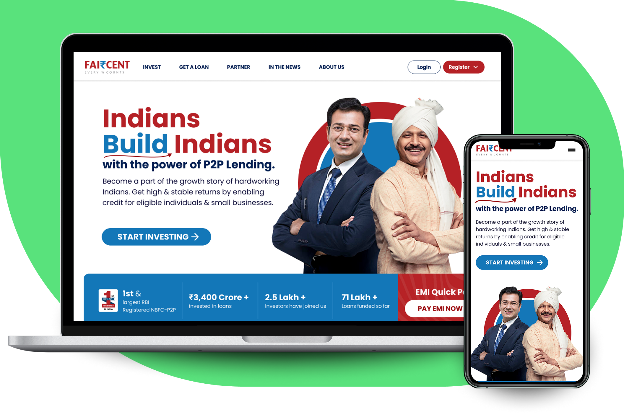
Ui Design for These pages included Homepage, Borrower, Lender with responsivenes.

img

Typography & UI Component

A design system is a collection of reusable UI components and design standards used to create consistent user experiences across a range of digital products.
img